Human Vision
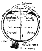
Light is focused by the cornea and the lens onto the retina at the back of the eye.
Vitreous humor - liquid inside the cornea is close to water, and has the same index of refraction as water. If we are under water the light is not refracted, but it is refracted if we are not in water. ( Which is why SCUBA divers need masks to see underwater - The mask traps an air space so that there is a refraction entering the eye. )
Light passing through the center of the cornea and lens hits the fovea (or Macula).
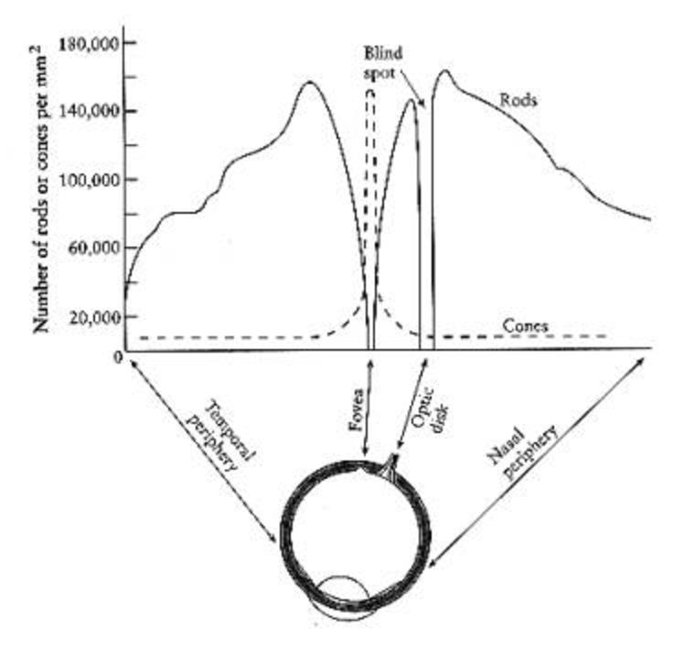
Human eye has 2 types of photosensitive receptors: cones and rods
cones
- operate at higher illumination levels
- provide better spacial resolution and contrast sensitivity
- provide colour vision
- operate at lower illumination levels
The rods are highly concentrated 10-20 degrees on both sides of the fovea, but almost none are at the fovea itself - which is why if you are stargazing and want to see something dim you can not look directly at it.
There is also the optic nerve which is 10-20 degrees away from the fovea which connects your eye to your brain. This is the blind spot where there are no cones and no rods. We can not see anything at this point though we are so used to this that we do not notice it unless we try to see the blind spot.
Bill Sherman's diagram
Try the following link if you want to see (or not see) your blind spot: http://serendip.brynmawr.edu/bb/blindspot1.html
What happens when we walk from a bright area into a dark area, say into a movie theatre? When we are outside the rods are saturated from the brightness. The cones which operate better at high illumination levels provide all the stimulous. When we walk into the darkened theatre the cones don't have enough illumination to do much good, and the rods take time to desaturate before they can be useful in the new lower illumination environment.
It takes about 20 minutes for the rods to become very sensitive, so dark adjust for about 20 minutes before going stargazing.
Since the cones do not operate well at low light intensities we can not see colour in dim light as only the rods are capable of giving us information. The rods are also more sensitive to the blue end of the spectrum so it is especially hard to see red in the dark (it appears black).
Here are some favourite optical illusions:
http://www.ritsumei.ac.jp/~akitaoka/saishin-e.html
There are several pages of optical illusions on the web:
http://www.ads-online.on.ca/illusion/directory.html
http://www.patmedia.net/marklevinson/cool/cool_illusion.html
and of course there's always M.C. Escher ...
http://www.worldofescher.com/gallery/
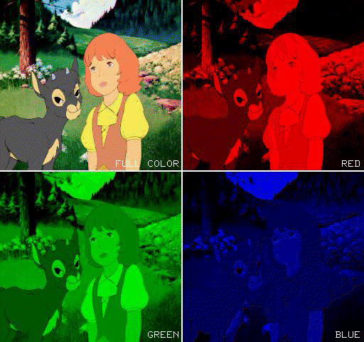
Computer graphics is based on illusion, from the R, G, and B phosphors on a CRT to creating an illusion of 3D on a (relatively) flat CRT screen.
Acromatic Light
no colour, only greyscale with 0 as black, and 1 as white.quantity of light or intensity of light is the only parameter
To human beings, brightness (perceived intensity) has a logarithmic scale, not a linear scale.
CRTs can not get completely black due to light reflection within the tube. Minimum values range from 0.005 to 0.025 of the maximum intensity.
ration of maximum to minimum intensity is the dynamic range of the CRT.
for n+1 intensities and a minimum intensity of Io and a maximum intensity of 1, the ratio of succeeding intensities is:
          (1/n)            (n-j)/n
r = (1/Io)      and Ij = Io
For 10 intensities from 0.1 to 1
r = 1.292 and the 10 intensities are:
0.1 0.13 0.17 0.21 0.28 0.36 0.46 0.59 0.77 1.0whereas a linear scale would be:
0.1 0.20 0.30 0.40 0.50 0.60 0.70 0.80 0.90 1.0The number of distinct intensities needed for smooth continuous tone depends on the dynamic range of the device. The human eye can not distinguish between intensities with a ratio of less than 1.01.
so with 1/Io as the dynamic range, w set r = 1.01 and want to find n.
            (1/n)
1.01 = (1/Io)
Through the magic of logarithms (which I am not even going to attempt to remember) we can find the following: for a CRT with dynamic range of 50 to 200, 400-530 intensities are needed
for a photographic print with range 100, 465 intensities are needed
for a photographic slide with range 1000, 700 intensities are needed
Chromatic Colour
hue:- distinguishes between colours
- how far is the colour from a grey of equal intensity
vivid colours (bright red, royal blue) are highly saturated, further from grey
pastel colours (pink, sky blue) are lightly saturated, closer to grey
- perceived intensity of a reflecting object
- perceived intensity of a luminous object
Why do CRTs have red, green, and blue phosphors?
Currently believed there are three kinds of cones in the human eye, one attuned to red, one to green, and one to blue (Young and Helmholtz) ... but this is still being debated.
Light is electromagnetic energy with wavelengths from 400nm - 700nm
peak red response at 580nm (reddish-yellow)
peak green response at 545nm (greenish-yellow)
peak blue response at 440nm
So the idea is to add an amount of red and an amount of green and an amount of blue to produce a wide range of colours.
Unfortunately we can not generate all the colours that the eye can see using an RGB CRT. We also can not generate all the colours that the eye can see using photgraphics film (though it can display a larger part of the visible spectrum than a monitor)

This is the CIE Chromaticity diagram developed in 1931. ( See Color plate II.2 in Foley for a better image of this. ) If luminance is included this becomes a 3D cone, by normalizing we reduce the cone to a plane (the X + Y + Z = 1 plane). Chromaticity depends on dominant wavelength (hue) and saturation only. As with homogeneous coordinates, different luminances are mapped onto the same point on the plane. So this plane DOES NOT contain all the possible colours as colour also depends on luminance (lightness or brightness).
Unfortunately you cant mix positive amounts of the three primary colours (red, green, and blue) to create all of the possible colours that we can see. So for the diagram above there are three primary colours X, Y, and Z are defined so that you can add X and Y and Z together to get all of the possible colours - so by definition X, Y, and Z are not be red, green, and blue and the colour matching functions (the curves) of X, Y, and Z are not the curves of red, green, and blue.
(for athorough explanation of the x,y axis, you should see section 13.2.2 (p579) in the Foley et al text)
The curvy region is the colours we can see. The boundary stretches from purple at 400 near the origin to green at 510 near the top of the y axis to red at 700 at the far right.
White light is defined to exist near the center of the space.
Given 2 points within the region the colours on the line between those 2 points are mixtures of those two colours.
If you have a point (colour) in the space and draw a line from the nearest boundary through the point to the white-light center you can determine the dominant wavelength (hue) and saturation. The dominant wavelength is the point where the boundary is crossed, and the saturation is a measure of how close the point is to the white-light center from the boundary. Some colours (in the purple to red range) do not have a dominant wavelength as the lower ende of the curve does not represent spectral colours. these non-spectral colours are defined as being complementary colours to the dominant wavelength on the other side.
Complementary colours exist on opposite sides of the white-light center, whose mixture yields the white-light center.
The triangle shows the colours we can make by adding R, G, and B. Different hardware has different triangles allowing us to compare the gamuts (colour ranges) of different devices on the same diagram.
One other factor that can be important in computer graphics is the decay rate of certain colours. We have talked about how the graphics get refreshed on the screen at 60 or 96 or 120 times per second, but depending on the chemical or physical processes inside the display hardware, the previous image may not totally be replaced by the new image. This can generate ghosting.
More info on the CIE diagram can be found here: http://hyperphysics.phy-astr.gsu.edu/hbase/vision/cie.html
Colour Models
- RGB
- CMY
- YIQ
- HSV (HSB)
RGB has three primary colours Red Green Blue, each of which ranges from 0 to 1, which are added together to form the final colour.
One way of showing the RGB color model is with the color cube, having black at the origin ( 0, 0, 0 ) and red, green, and blue along the three principal axes:
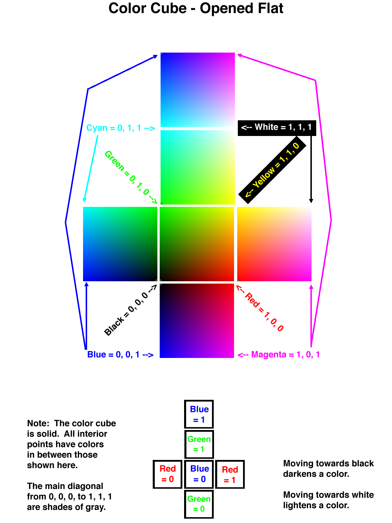
if the r,g,b values are identical then the resulting colour is grey, ranging from black (0,0,0) to white (1,1,1).
- (0,0,0) -> black
(1,1,1) -> white
(1,0,0) -> red
(0,1,0) -> green
(0,0,1) -> blue
(1,1,0) -> yellow
(1,0,1) -> magenta
(0,1,1) -> aqua
CMY and CMYK
Red, green, and blue work well for mixing light on a comptuer screen, but they don't work so well for mixing inks on a printed page. Therefore printers generally prefer to use the CMYK scale.
CMY has three primary colours Cyan Magenta Yellow (the complements of red, green and blue) each of which ranges from 0 to 1, which are subtracted from white to form the final colour.
cyan is white minus red, leaving only green and blue
magenta is white minus green, leaving only red and blue
yellow is white minus blue, leaving only red and green
white is at the origin (1,1,1)
- (1,1,1) -> black
(0,0,0) -> white
(0,1,1) -> red
(1,0,1) -> green
(1,1,0) -> blue
(0,0,1) -> yellow
(0,1,0) -> magenta
(1,0,0) -> aqua
_  _    _  _    _  _
| C |   | 1 |   | R |
| M | = | 1 | - | G |
| Y |   | 1 |   | B |
-  -    -  -    -  -

_  _    _  _    _  _
| R |   | 1 |   | C |
| G | = | 1 | - | M |
| B |   | 1 |   | Y |
-  -    -  -    -  -
Note that mixing all the light together yields white light ( 1, 1, 1 in the RGB scale ), whereas mixing all the inks together yields black ink ( 1, 1, 1 in the CMY scale. ) At least in theory. In practice, however, it is hard to get a good black ink by mixing together other colors, and since black is such an important color in most printing applications, the printers add it in as a fourth color:
CMYK adds blacK as a fourth parameter to CMY
- K = min(C, M, Y)
C = Ccmy - K
M = Mcmy - K
Y = Ycmy - K
YIQ
recoding of RGB for US television broadcasts
Y = luminance, and is the only component shown on black and white TVs.
_  _    _                      _    _  _
| Y |   | 0.299   0.587   0.114 |   | R |
| I | = | 0.596  -0.275  -0.321 | * | G |
| Q |   | 0.212  -0.528   0.311 |   | B |
-  -    -                      -    -  -
HSV (HSB)
Hue
Saturation
Value (Brightness)
A hexcone, ( usually displayed with the point down ), with black at the point, white in the center of the base, and the fully saturated colors around the rim of the base. In this model, hue is an angular dimension from 0 to 360 degrees about the circle, saturation is a radial dimension from the centerline of the cone to the edges, and value is an axial dimension down the long centerline of the cone. The HSV model can also be explained as the hexagon seen when viewing the color cube along the main diagonal from the white corner towards the black corner, and including smaller sub-cubes as one approaches the point of the cone.
HLS
Hue
Lightness
Saturation
Similar to HSV, but a double cone with white at one tip, black at the other, and 50% grey in the very center.
There is a lot of research out there on how to effectively use colour, and many, many examples of how not to use colour.
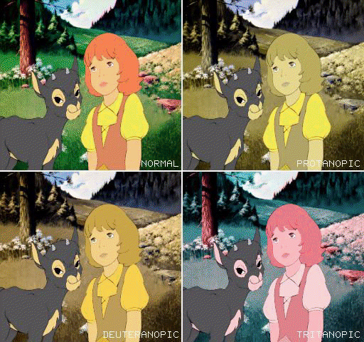
Colour Blindness
8 percent of men0.5 percent of women
Here is another image from Cornell (http://www.graphics.cornell.edu/KOC95/color/color.html) showing how the previous image would look for 3 of the more common types of colour blindness.
Appropriate Use of Colour
Colour is a very powerful tool - and therefor a dangerous tool. Aside from issues of colour blindness and other physiological issues we looked at with the optical illusions, there is a lot of cultual baggage associated with colour. If colour is important in the computer graphics that you are doing (eg scientific visualizations) you need to learn about colour of work with someone who knows about colour.Here is a very good starting point: Interaction of Color by Josef Albers
2D Cues to Depth
We determine depth through a combination of 2D and 3D cues, which is how many of the optical illusions at the beginning work, and how we can play 'Doom' and get a sense of 3D space and motion.Some people do not have stereo vision so all of their depth cues are 2D, and they do very well with only these 2D cues.
There are eight 2D depth cues:
- Overlap
- Apparent Size (size consistency)
- Differential Size
- Linear Perspective
- Motion Parallax
- Aerial Perspective
- Texture
- Shading and Lighting
Apparent Size As an object moves towards us it gets larger in our retina but we do not perceive it getting bigger. We understand that it isn't changing its size as it moves.
Differential Size If we know that two objects are the same size and one appears to be smaller than the other then the smaller one is further away.
Linear Perspective Parallel lines converge to the vanishing point as they go off in the distance.
Motion Parallax Objects that are closer will move 'more' or 'faster' than objects that are further away.
Aerial Perspective Fog/Smog/Dust/Dirt in the air make objects that are further away appear less distinct.
Texture You can only discern textures when an object is near, otherwise the surface appears uniform.
Shading and Lighting for a lot of small reasons.
The dominant cue at long distances is differential size
The dominant cue at intermediate distances is motion parallax
The dominant cue within 12" is stereo vision
No comments:
Post a Comment